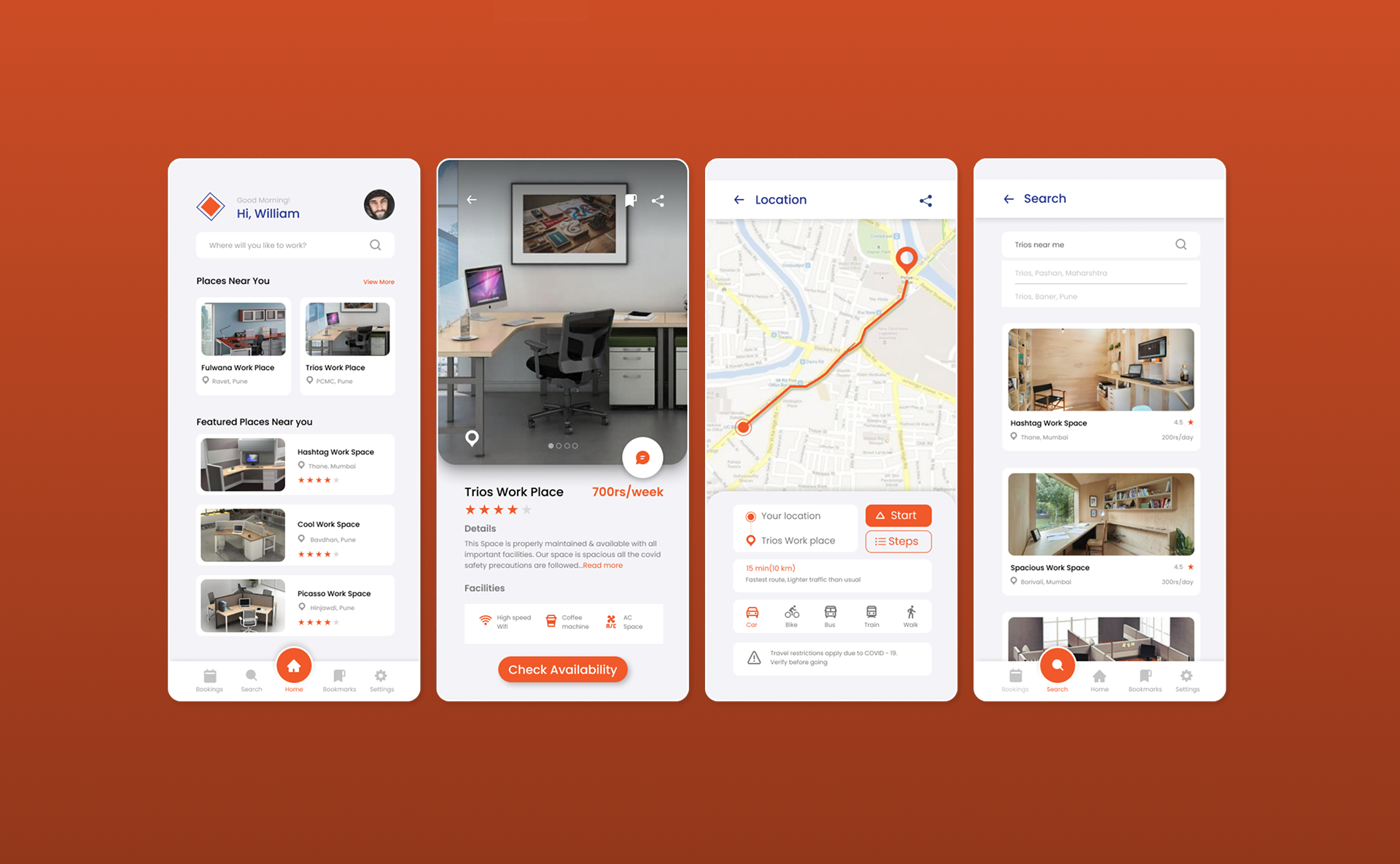
Context
When home stopped working as an office
Offices closed overnight, and homes became workplaces they were never meant to be — full of interruptions, and short on the calm and connectivity that focused work needs.
About Work Space
Work Space is an organisation where you can register or book a place to work. During the shift to working from home, many people struggled to stay productive. The aim was simple: make a genuinely good workspace available and easy to book, so people can work near home without disturbance.
Users open the app to find places to work that follow proper COVID-19 precautions. They can choose a space by how near it is, its cost, and whether it has the Wi-Fi and room they need — then book it, pay online, and work for exactly the time they require.
“During COVID-19, people wanted to keep following safety precautions while still working in a good, focused environment.”
The design process
Requirement Gathering
Competitive Analysis
Research Insights
Persona Creation
Task Flow
Wireframes
Prototype
Structured as a double-diamond: Discover, Define, Ideate, and Design.
Discover
Understanding what people actually needed
Requirement gathering and a competitive review defined what a good workspace-booking experience had to get right.
What people wanted from a workspace
- Good workplaces nearby, with proper COVID-19 precautions
- All-time Wi-Fi connectivity and reliable power
- The ability to check availability before travelling
- A price comparison across the places available
- Ratings and photographs of each place
- Small comforts — like a coffee machine on site
Competitive analysis — WORKA
What worked
- Location and directions to the workplace
- Most important facilities listed
- Availability confirmed after viewing place details
- Good filter options
- Clear information on COVID safety measures
Where it fell short
- Only for group meetings and conferences
- Places hidden until you share your location
- No nearby options surfaced
- Must enter all booking details before seeing a place
- Sometimes shows “unavailable” only after all that effort
- Lowest price not shown on the details page
The gap to design into
Define
From survey signals to a real person
A short survey of around 20 people, then a persona to keep every decision grounded in a real situation.
What the survey told us
Around 20 people responded through a Google Form survey.
Common requirements from users
Persona Creation

Soham
Corporate Employee
Description
Soham is a corporate employee working from home. He has two kids at home and is frustrated by their interruption while he is working. He is not able to work efficiently and passionately at home as he used to in the office.
About
- 29
- Pune
- IT Engineer
Offices are closed but I am not able to focus on my work at home. I need a calm place to work efficiently.
Goals
- To get a working place with all facilities required by booking.
- Get to know and compare prices in one platform.
Pain points
- Frustrated with work from home model
- Disturbance due to kids & household chores
- Internet issues at home due to electricity problems
Motivations
- Available facilities like air conditioner, coffee machine, peaceful & calm environment, Wi‑Fi & electricity.
- Reviews, ratings & images of places needed.
Personality
Technology
Mobile
80%
Laptop
70%
Softwares
85%
Mobile Apps
90%
Website
60%
“Offices are closed but I am not able to focus on my work at home. I need a calm place to work efficiently.”
Ideate
Mapping the booking journey
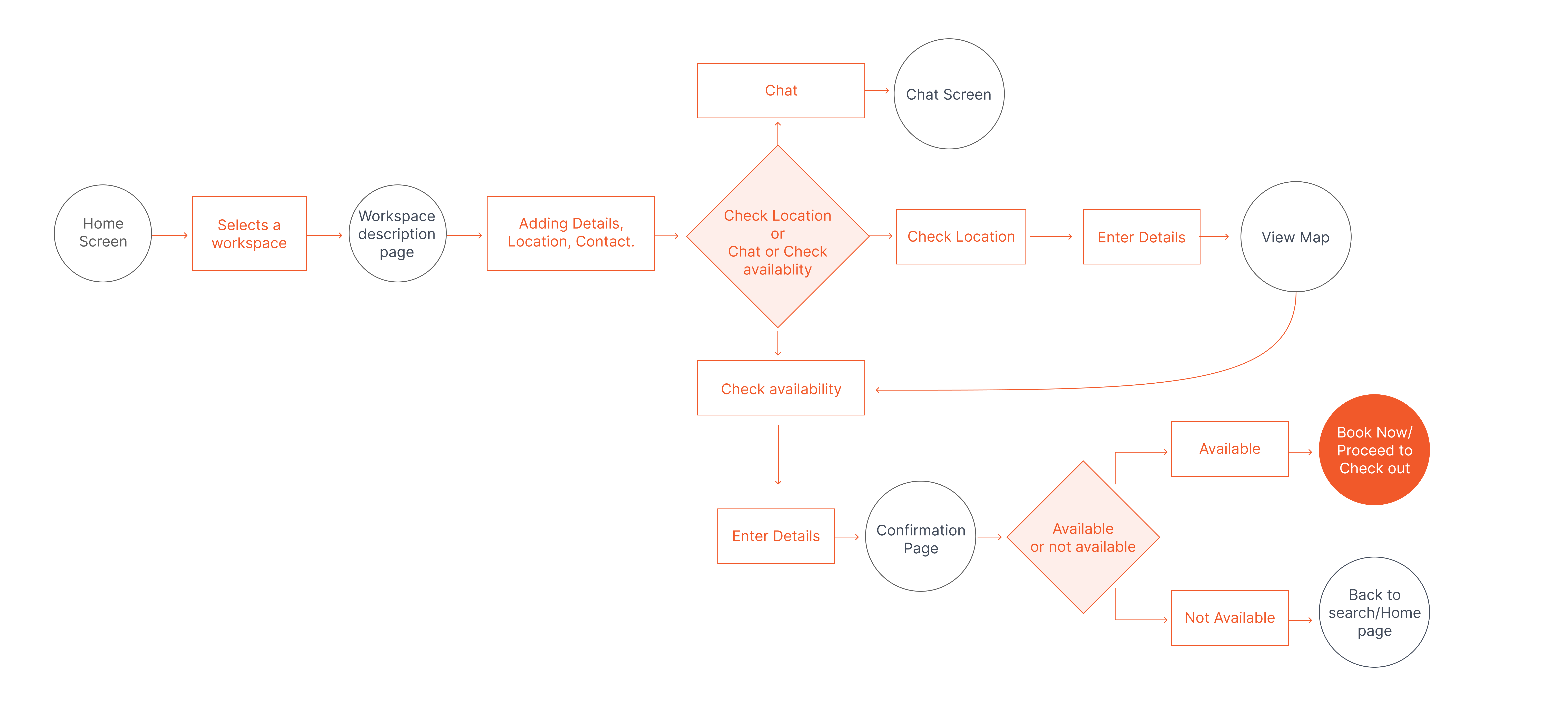
A task flow tested the path a user takes from opening the app to a confirmed booking — before any screens were designed.
Scenario — booking a nearby space for five days
The happy path
Home screen
Select a workspace
Space description
Check availability & location
Enter details
Book / checkout
Confirmation
Task Flow
Scenario: Soham wants to book a nearby workplace for 5 days of working.
Design
From wireframes to final UI
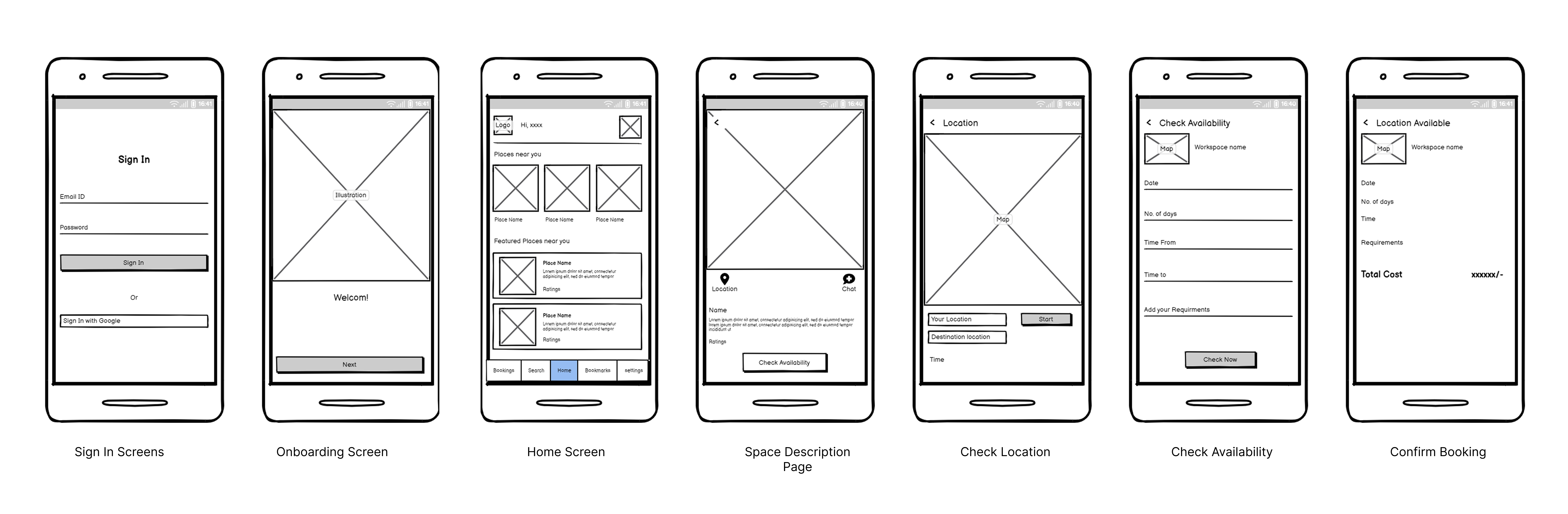
Low-fidelity wireframes established the structure of each screen before the final visual design brought it to life.
Wireframes
The core screens, sketched before styling.
Final design
Final hi-fi screens in the same staggered flow as the case study deck — from splash and sign-in through booking, plus settings and profile flows.
Splash Screen
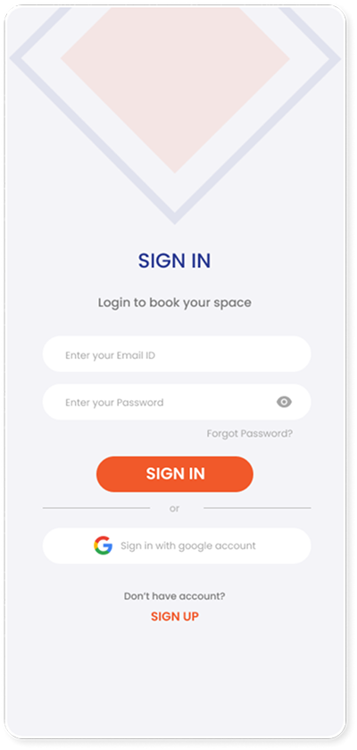
Log In Screens
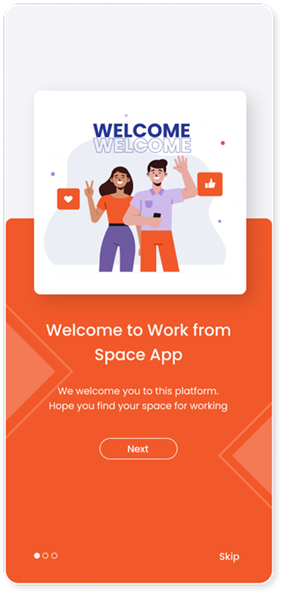
Onboarding Screen 1
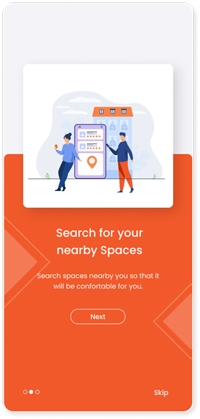
Onboarding Screen 2
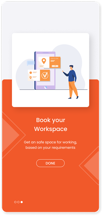
Onboarding Screen 3
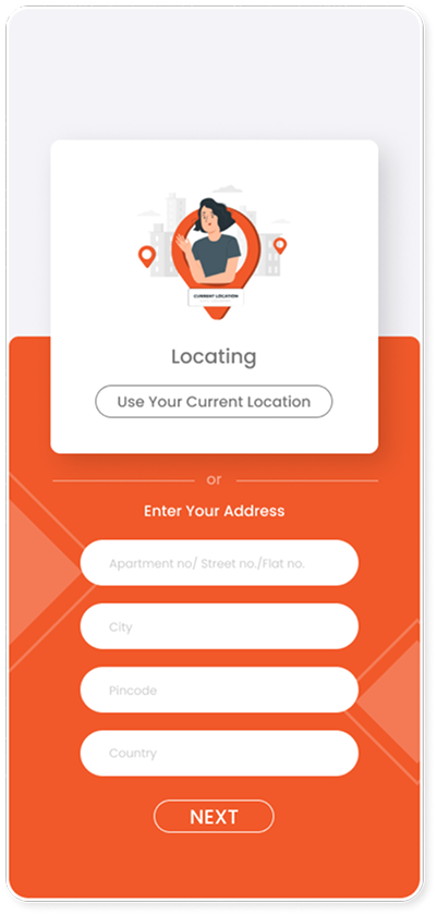
Select Location
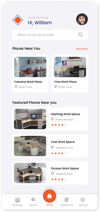
Home Screen
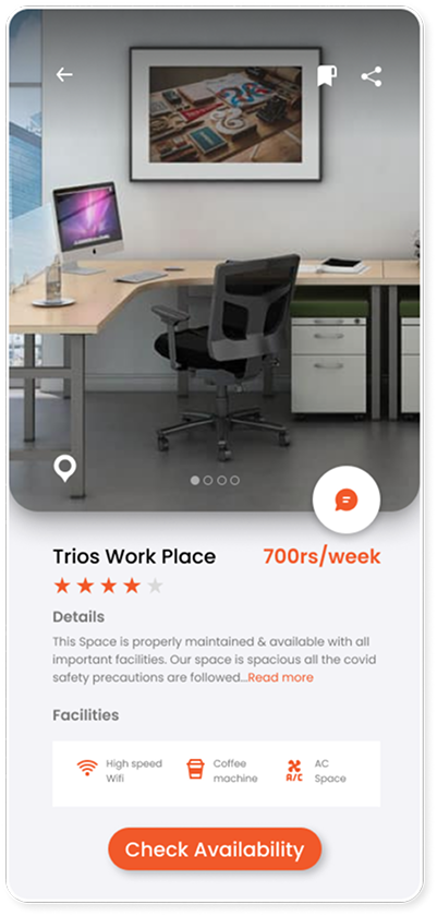
Space Description Page
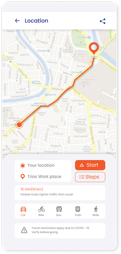
Check Location
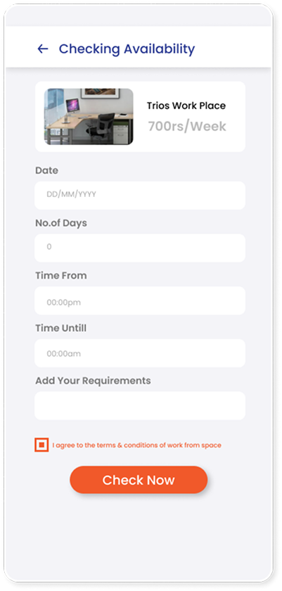
Check Availability
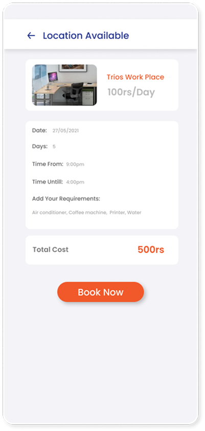
Confirm Booking
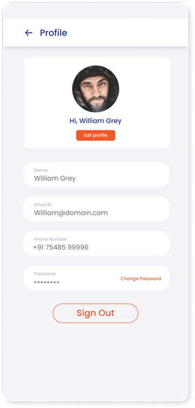
Settings
Profile
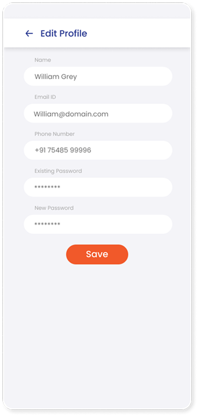
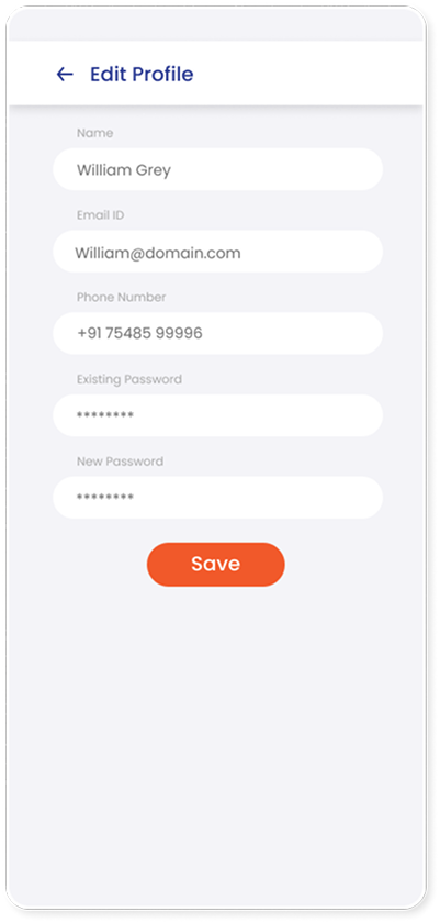
Edit Profile
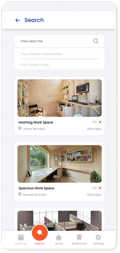
Search
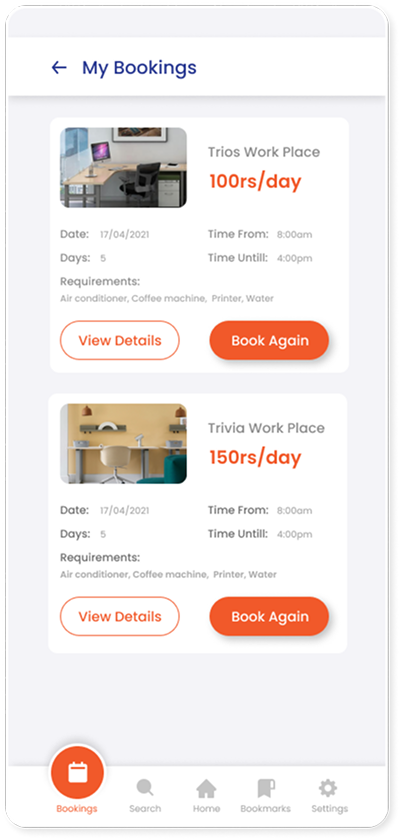
My bookings
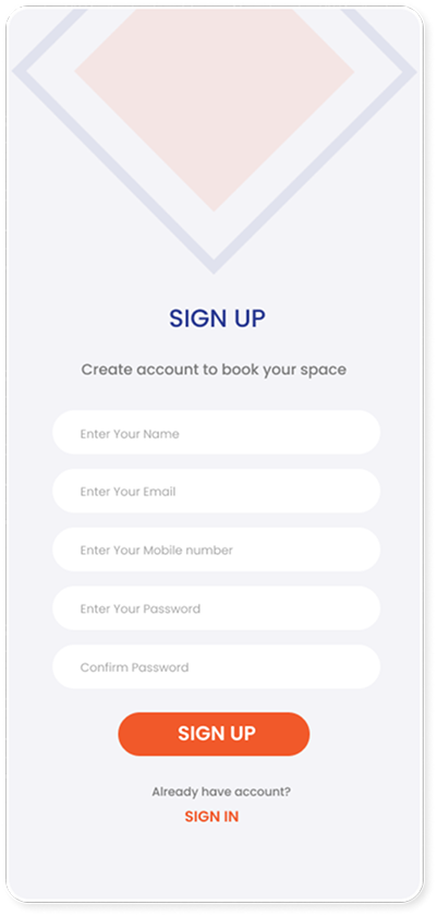
Sign Up Screen
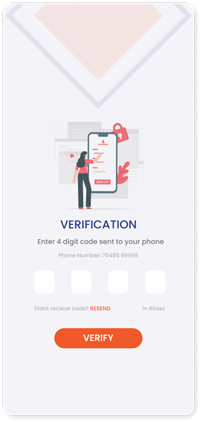
Verification Screens
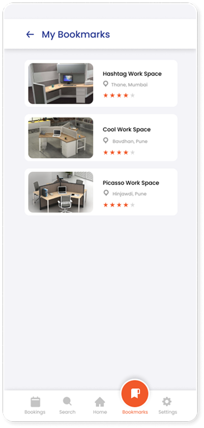
Bookmarks
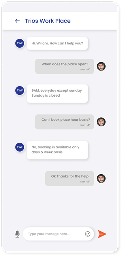
Chat screen
What this project taught me
Show value before asking for effort
The clearest lesson from the competitor was to surface nearby options, price, and availability up front — instead of making people fill in everything before they learn a place is unavailable.
Research kept the problem honest
The survey reframed the brief: the real problem wasn't a lack of tools, it was a lack of focus at home — most disruption came from kids, chores, and unreliable power and internet.
Comparison belongs in one place
People wanted to weigh price, ratings, facilities, and distance together. Bringing those into a single view was the difference between a booking tool and a genuinely useful one.