The Story
When the airport stops feeling predictable
Airports are built around movement — check in, drop baggage, clear security, find the gate, board. For a traveller, the experience is rarely that linear.
A terminal full of information, a traveller full of questions
A terminal can be huge. A gate can change. A flight can be delayed by hours. A passenger may suddenly have time to kill but no idea where to find a restroom, food, a charging point, or even the next boarding gate.
The original concept behind EaseAirport started with a simple question:
“How might we make the airport experience easier to understand and easier to navigate, especially when a traveller's plan changes?”
Three things every traveller needs in the moment
The response
The Problem
The real problem is uncertainty
Travellers can experience multiple problems simultaneously inside an airport. The design opportunity is to turn scattered information into an actionable next step.
Brainstorming on the problems faced inside the airport
Early exploration mapped four recurring friction points from the traveller's perspective.
Travellers getting lost in Airport
Some people have fantastic spatial awareness, others not so much, but most people have got lost at least once in their life

Confusion in the Airport Terminals
Oftentimes, a flight will have a certain terminal written on it at the time of booking but the carrier may have changed it to a different one later

Flights can be Delayed
Delays in flights lead to waiting and gets the traveller blocked in the airport. Its hard to find the needs like restroom, eating space & other time sparring activities

Forgetting or losing the Documents
Travellers can forget or loose there important documents while travelling and this can cause severity while entering the airport or during check-in process

“Create a single, contextual experience that tells travellers what is happening, what they need to do next, and where they need to go.”
The Traveller
Shreyas Singh — when a routine trip turns uncertain
A business analyst travelling Pune → Mumbai → Delhi. Mumbai is a layover. Then the first flight is delayed — and a predictable journey becomes an uncertain waiting period.
Meet Shreyas Singh

Shreyas Singh
28 · Business Analyst
Pune → Mumbai → Delhi
Shreyas is a 28-year-old business analyst who values efficiency and is comfortable with technology. He is not looking for dozens of features — he needs confidence in the next step when his plan changes mid-journey.
Interests & traits
- I am well-organised and detail-oriented because I want a smooth, seamless travel experience.
- I value efficiency and convenience because time is precious to me.
- I am tech-savvy and comfortable using digital tools to enhance my travel experience.
- I seek opportunities for adventure and unique experiences while travelling.
Goals
- Real-time flight and gate information
- Airport navigation across terminals
- Quick access to amenities when needed
- Clear boarding progress at every stage
Pain points
- Navigation anxiety in large airports
- Information overload from scattered sources
- Uncertainty when flights are delayed or gates change
- Finding amenities at the wrong moment during a layover
Persona artifact from the Figma exploration — interests, traits, goals, and pain points that shaped feature priorities.
User Journey
Mapping the airport from check-in to arrival
The journey was mapped across five stages — each revealing where uncertainty peaks and where the product can intervene.
User journey mapping
Check-in → Boarding (1st flight) → Layover → Boarding (2nd flight) → Check-out. Each stage surfaces actions, emotions, pain points, and product opportunities.
Four recurring needs across the journey
The journey mapping exercise surfaced needs that became the foundation for the feature architecture.
Orientation
Travellers need to understand where they are and where they need to go — especially across terminals and floors.
→ Navigation should connect digital instructions to physical airport landmarks, not just show a map.
Progress
Travellers need to know what step they are on and what comes next in the boarding sequence.
→ Break the airport process into a progressive checklist rather than asking travellers to remember the full hierarchy.
Awareness
Flight information is distributed across screens and announcements — gate changes are easy to miss.
→ Surface important changes before the traveller has to search for them.
Assistance
Delays create unexpected time — but travellers struggle to find restrooms, food, or charging when they need them most.
→ Amenity discovery belongs inside the journey context, not as a separate directory.
Pain Points to Opportunities
Turning traveller problems into product direction
The brainstorming exercise translated pain points into opportunities — establishing a principle that the app should turn information into an actionable next step.
From traveller problem to UX opportunity
Feature Prioritisation
Must-have capabilities vs future opportunities
The feature list was divided to focus the MVP on the moments of highest uncertainty — boarding, navigation, and flight status.
What ships first, what comes later
Must have
- Guided boarding process — Check-in → Baggage → Security → Boarding Gate → Departure
- Airport navigation — floor maps, directional navigation, gate navigation, amenity locations
- Flight status — delay updates, gate changes, arrival/departure status, alerts
Good to have
- Accommodation suggestions for long delays
- Language and culture assistance for international travellers
- Document storage — potential DigiLocker integration
- Contextual notifications for gate changes and delays
- Future: ticket booking and luggage support
Information Architecture
Organised around the journey, not isolated features
The experience is structured around five primary areas — each answering a different question the traveller asks at a different moment.
Home · Boarding · Navigate · Amenities · Profile
Home
The personalised starting point — current flight details, timing, terminal, gate, layover information, and journey updates.
Boarding
The action-oriented checklist — current step, completed steps, upcoming steps, and boarding information.
Navigate
The spatial layer — airport layout, floor maps, directional navigation, gate navigation, and amenity locations.
Amenities
The discovery layer — search and locate food, restrooms, charging stations, and other facilities with directions.
Profile
The personal layer — traveller information and a potential home for future document and preference management.
UX Process
From discovery to interface
The process moved from understanding airport pain points through journey mapping, prioritisation, structure, and design.
From discovery to validation
Seven stages — research and framing first, then structure, design, and scenario testing.
Discover
Traveller context and airport pain points
Define
Uncertainty and navigation as the core problem
Map
Journey friction and decision moments
Prioritise
Must-haves vs future opportunities
Structure
Information architecture and user flow
Design
Wireframes to high-fidelity UI
Validate
Scenario testing (see plan below)
Wireframe flow — from login to layover
The wireframe flow established the functional journey before investing in visual design.
Open app
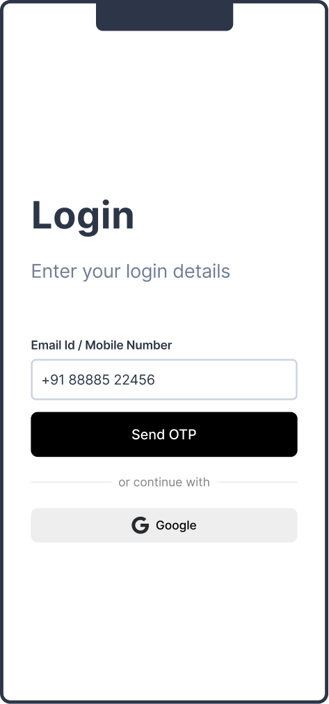
Log in
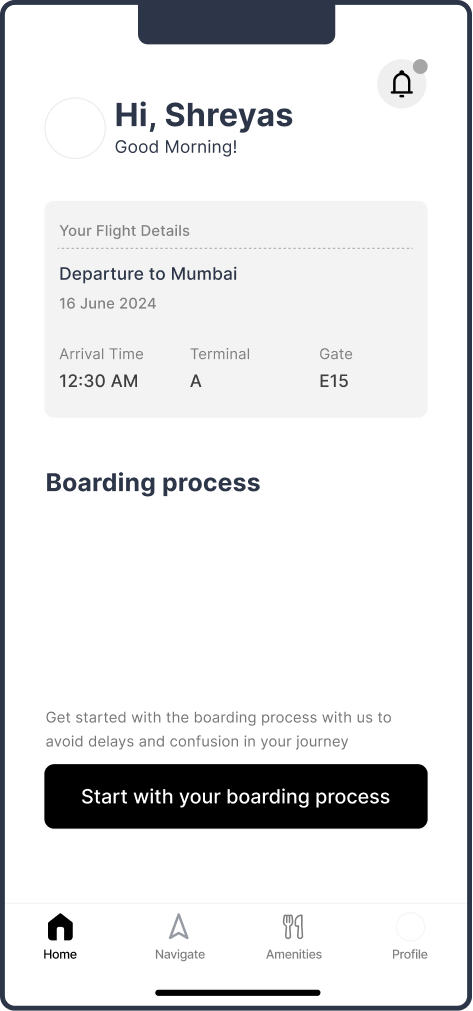
Personalised home
Boarding checklist
Key UX Decisions
Three interactions that define the product
Each decision connects a traveller problem to a specific interface pattern — boarding progress, disruption awareness, and in-context amenity discovery.
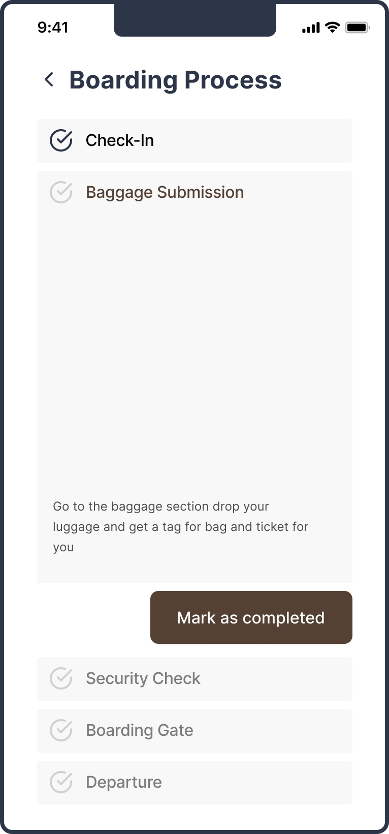
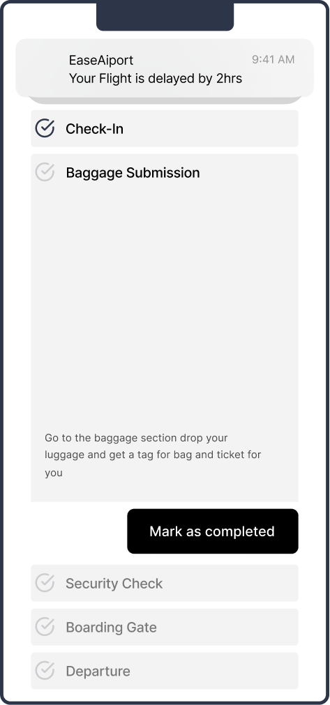
Turn the airport process into a progressive checklist
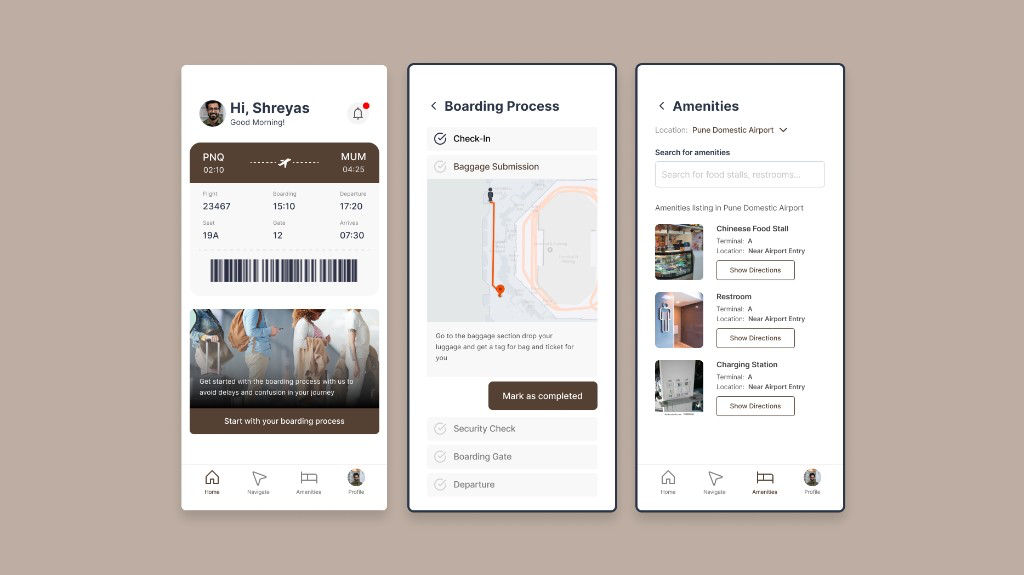
Instead of asking the traveller to figure out the airport, the boarding screen breaks the journey into manageable steps: Check-in → Baggage Submission → Security Check → Boarding Gate → Departure. Each stage gives a clear sense of progress and a single next action.
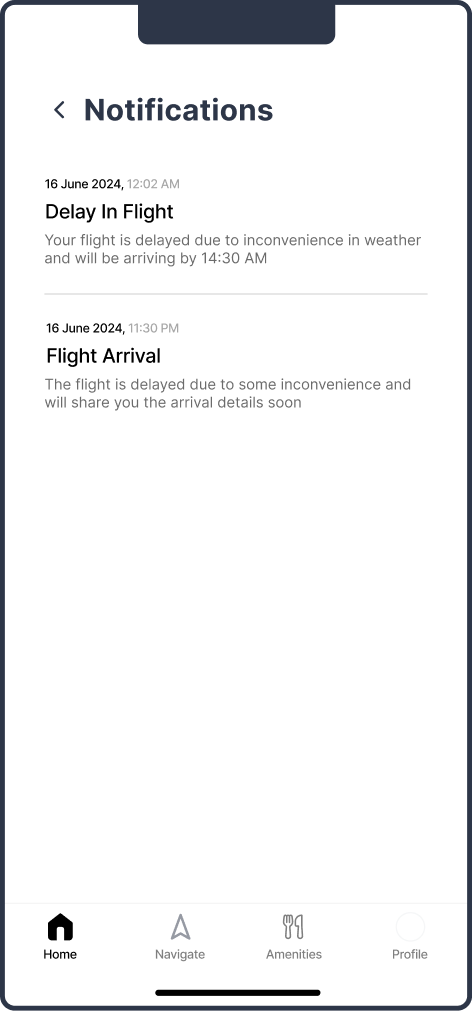
Design for the moment the journey stops going to plan
The disruption UI communicates delay state, updated timing, arrival updates, and gate information. A future opportunity: connect delay duration to contextual assistance — nearby food, restrooms, charging, lounge access, and a recalculated route to gate.
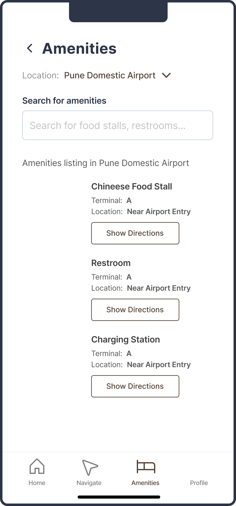
Keep amenity discovery inside the journey
The amenities screen supports search, facility listing, terminal and location detail, and one-tap directions. Discovery happens in context — tied to where the traveller actually is in the airport.
High-Fidelity Design
Screens grouped by traveller problem
The final UI is organised by what the traveller needs — not by feature list — with each group tied to a specific moment of uncertainty.
Help me understand my journey
Home and boarding — personalised flight context with a clear next step.
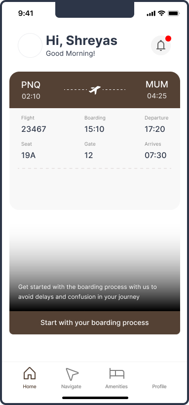
Personalised home — flight, terminal, gate
Boarding progress checklist
Tell me when something changes
Flight status and notifications during disruption.
Delay alert with updated timing
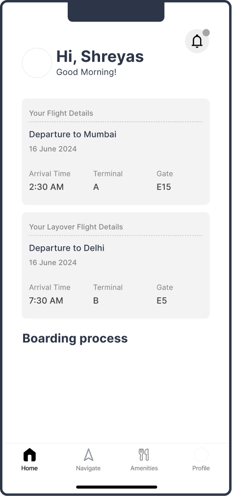
Layover flight details and connection context
Help me use my waiting time
Amenity discovery during layover and delay — search, list, and navigate to nearby facilities without leaving the journey context.
Search by facility type, see terminal and location, and get one-tap directions.
Designing for the layover
The layover is where EaseAirport becomes more than a navigation tool. Shreyas moves from first flight → waiting → next flight. During this period the app becomes a personal airport companion.
Immediate needs: where is my next gate, how much time do I have, where can I sit, eat, or charge my phone, and where is the restroom. Future needs — accommodation, language assistance, cultural information, document access — point toward a broader travel continuity platform.
Six principles that guided the design
Reduce uncertainty
Surface important changes before the traveller has to search for them.
One next action at a time
The traveller should understand what needs attention now — not the entire airport process at once.
Context over complexity
Show information relevant to the current airport, flight, terminal, and stage.
Design for disruption
The experience should become more useful when the journey goes wrong, not less.
Spatial clarity
Navigation should connect digital instructions with physical airport landmarks.
Keep critical information persistent
Flight, gate, and boarding status should remain easy to access from any screen.
What I Would Validate Next
Proposed usability testing — not measured results
The source material does not include usability-test metrics or post-launch analytics. These are proposed validation scenarios and success signals for a next phase.
Representative test scenarios
Proposed success signals
Behavioural measures
- Task completion rate
- Time to locate a destination
- Error rate during navigation
- Time to identify a flight-status change
- Number of interactions to find an amenity
Qualitative signals
- Can users identify their next step quickly?
- Do users notice important flight changes?
- Does the boarding progress indicator feel clear?
- Does the experience feel more reassuring during a delay?
- User confidence before and after completing a task
Accessibility & Future Vision
Beyond the MVP
A production-ready version should account for diverse travellers and evolve from airport companion to travel continuity platform.
Accessibility and edge cases to consider
- Navigation should offer accessible route information — not only the shortest route (e.g. fastest: 8 min vs accessible: 12 min)
- Different airport signage conventions and stress states (tired, rushing)
- Users who are unfamiliar with airport apps or travelling internationally
Three stages of product growth
Stage 1 — Airport Companion (now)
Boarding process, flight status, gate updates, airport navigation, and amenities.
Stage 2 — Disruption Companion (next)
Smart delay recommendations, accommodation, dynamic route changes, personalised suggestions, and luggage assistance.
Stage 3 — Travel Companion (future)
Ticket booking, digital document repository, language translation, destination culture information, and end-to-end travel planning.
“Airports are information-rich but decision-heavy environments. EaseAirport is designed to reduce that uncertainty by helping travellers know what is happening, where to go, and what to do next.”
Don't make travellers figure out the airport
Good travel UX manages uncertainty
An airport contains a huge amount of information, but travellers do not need all of it at once. They need the right information at the right moment, in the right context, with a clear next action.
The boarding checklist changes the interaction
Turning the airport process into a progressive checklist reduces cognitive load — from "I need to figure out the airport" to "I only need to complete the next step."
Disruption is the real test
The product becomes most useful when the journey stops going according to plan. Designing for delay — not just ideal-path navigation — is what separates a map from a companion.